What We Wore: Off to Work We Go
Exhibition Graphics | 2024
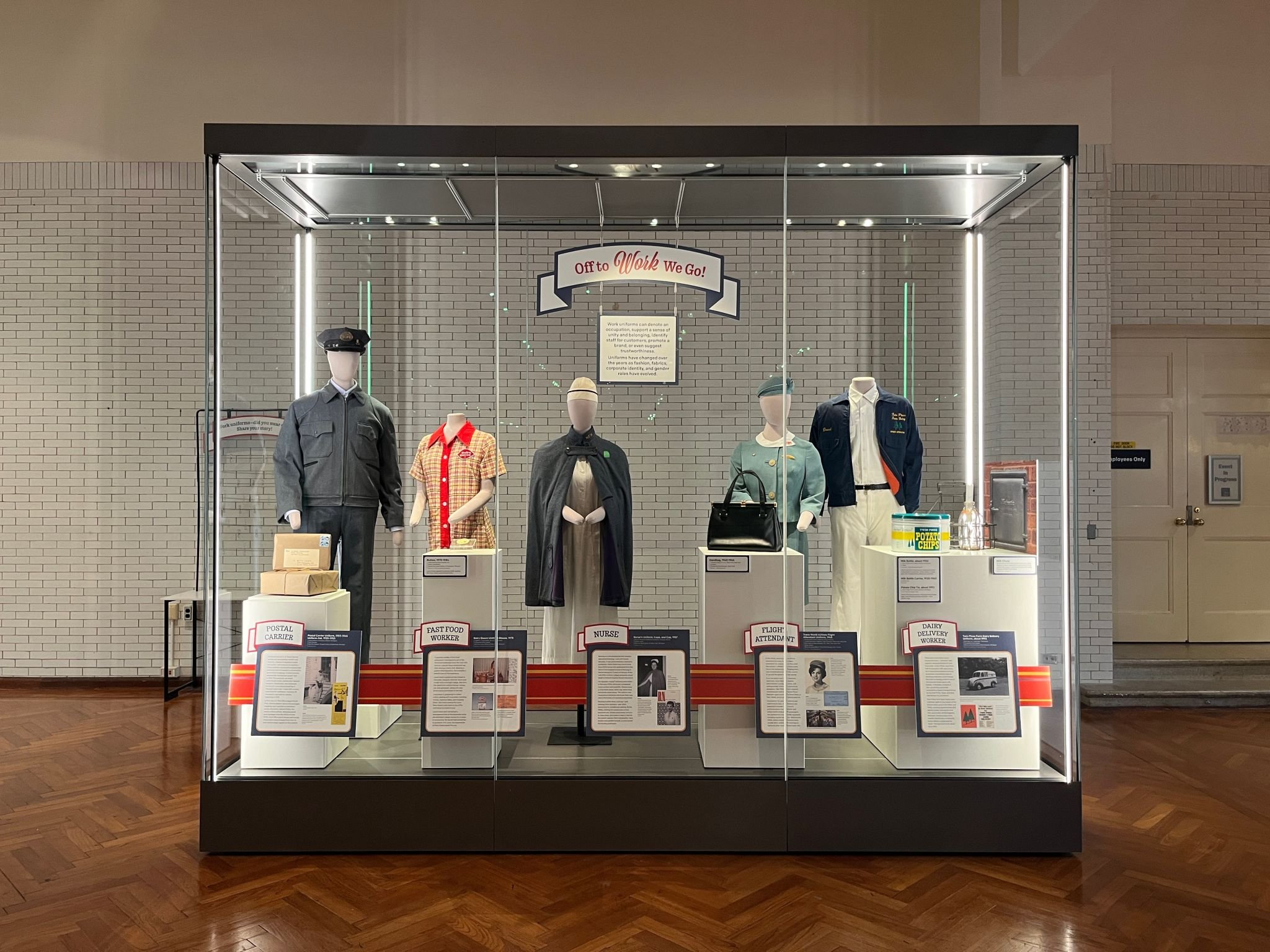
While interning at The Henry Ford Museum in Dearborn, MI, I had the opportunity to design the latest rotation for What We Wore, a collections platform that highlights different garments from the THF collection. This rotation, Off to Work We Go, features a variety of 20th-century work uniforms, from a postal carrier to a fast-food worker, offering a glimpse into the lives of the people who wore them.
The visual identity of the case incorporates a repeating ribbon motif, echoing mid-20th-century design trends and connecting the different uniforms through a unifying aesthetic. The design and color choices provide a subtle contrast to the uniforms to enhance the viewer’s focus on the garments.
This rotation of What We Wore came together through close collaboration with the talented THF team, including Jeanine Head Miller’s expertise on the historical context of each piece, Kate Herron’s careful work of displaying the garments, and Bradley Hinken and the Exhibits Team for making the custom reader rail come to life and installing the exhibit.
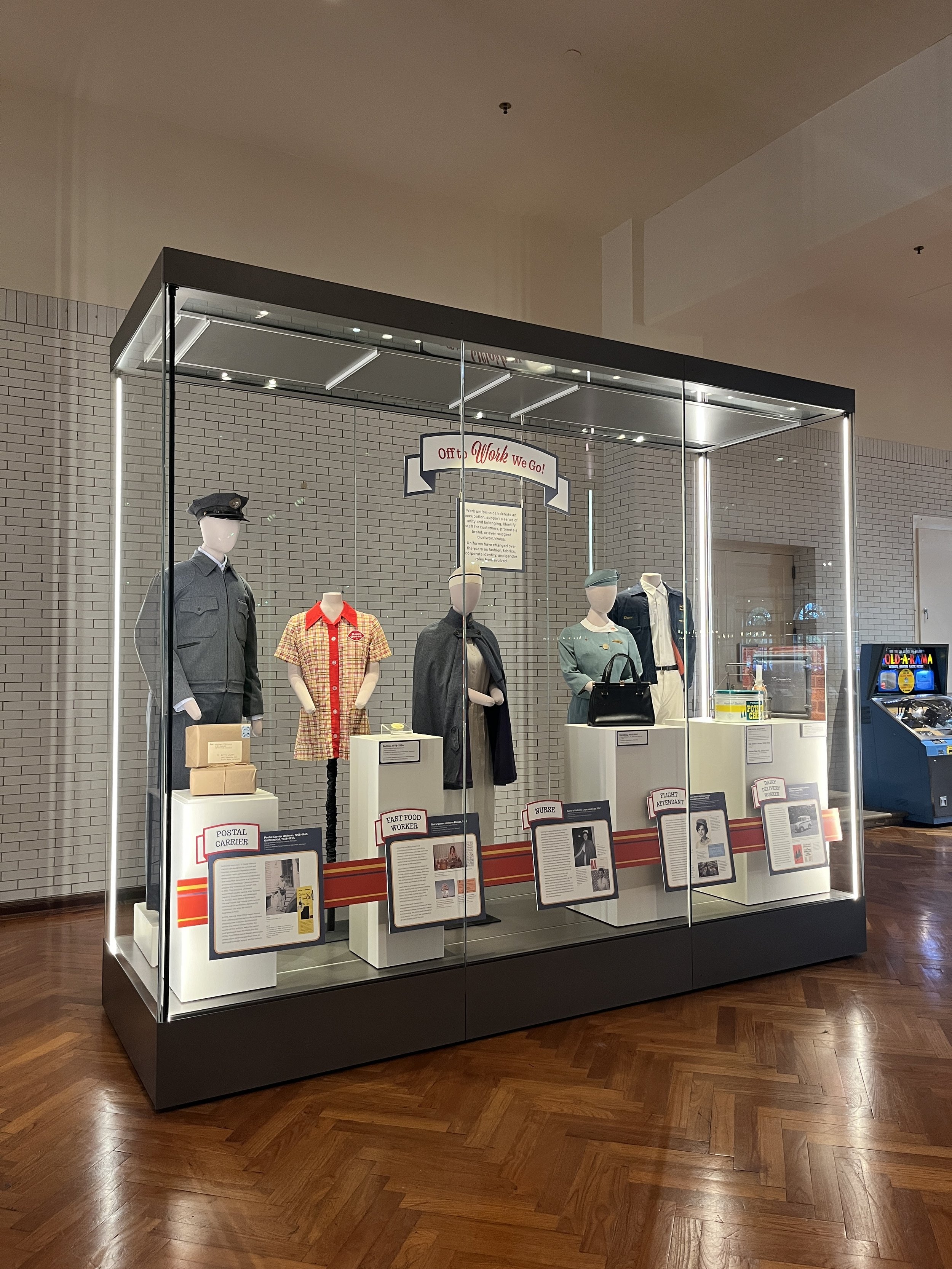
Side view of the full display.
Parcels with the postal carrier feature the small detail of how packages were addressed in the 50s—with no zip codes!
The prompt wall invites visitors to add their own stories to the exhibit.
The double sided image of a milk chute shows how dairy delivery workers used to make deliveries to homes.
Process
With five uniforms, accompanying objects, and extensive copy for each, we needed a custom solution to keep the display cohesive and accessible. I collaborated with 3D Designer Fern Linziger to develop a tailored reader rail, transforming my initial sketches into a final design that enhanced each uniform’s story while maintaining a cohesive visual flow across the display.
My sketches for the reader rail design
Final elevation with signage
Early sketches for the title banner
Fern Linziger's elevation with the angled reader rail design


